


- Contents
- Index
PureConnect CX Insights Help
Filtering Dashboard Content
Filter the data displayed in dashboard visualizations
Need to understand the items in a filter? And do you need to learn how to use a filter menu to include or exclude items in a visualization? You Can filter the data displayed in a dashboard to show only the information that you require.
Filter a visualization to customize the data displayed in a dashboard. For example, you can filter a visualization to display the current number of agents in specific statuses. You can also filter a visualization by media type to display the number of calls in a current shift, or filter by media type to display the number of chats for a workgroup from a previous shift.
Different filters are available depending on the dashboard you select. When you filter the data, the content in dashboard visualizations is immediately updated.
Filtering data
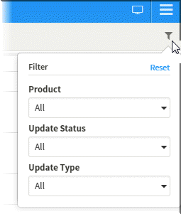
In the dashboard you selected, click the Filter icon to display the available filters.
Selecting filter items
To display a list of Filter items, click the down arrow.
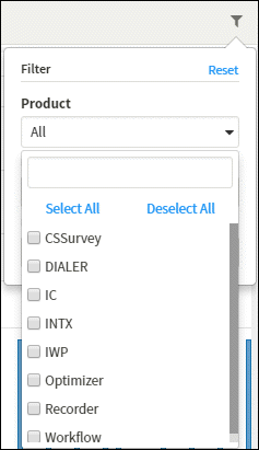
You can select an item from the list, or begin typing the filter item in the search field and select it from the list.
Select All
To select all of the filter items, click Select All.
Clear item check boxes
To clear the items for a filter, click Deselect All.
Clear all filters
To clear all of the items for all of the filters in a dashboard, click Reset.
Applying selected filters
To apply your selected filter items, click the filter icon. The filter icon changes color, and dashboard visualizations are updated with your filter selections.
Next, see Exporting Data From a Dashboard.