


- Contents
- Index
PureConnect CX Insights Help
Finding Your Way Around a Dashboard
Need to become familiar with the main features and common controls of a CX Insights dashboard? Here's how to use a CX Insights dashboard to filter and sort your real-time agent activity data.
CX Insights Dashboard
Dashboard Visualizations
Data is displayed in visualizations in a dashboard. Visualizations can include a bar chart, pie chart, and grid.
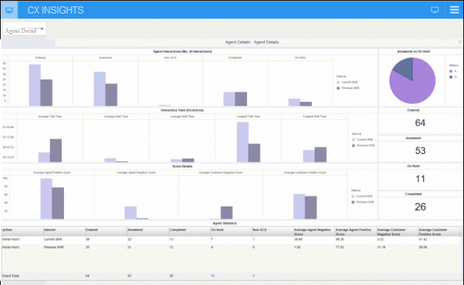
With CX Insights dashboards you can:
- Point to a graphical chart and display real-time agent statistics
- Use the Metrics legend for analyzing data
- Resize visualizations
- Sort and rearrange columns in a grid
Dashboard Filters
Use CX Insights dashboard filters to customize data displayed in visualizations. For example, in the Multiple Workgroup Overview dashboard, you can filter the data displayed in the Agent Availability bar chart visualization to view the number of agents currently on an Inbound ACD Interaction.
Dashboard Menu
Expand the CX Insights dashboard menu to view the logged on user name and server name, and to access dashboard controls.
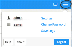
When you click the dashboard menu, it displays the controls to:
- Access Settings
- Change Password
- Save Logs
- Access Help
- Log Off
Closing a dashboard
To close a CX Insights dashboard, close the dashboard tab.
Next, see Filtering Dashboard Content.