


- Contents
- Index
PureConnect CX Insights Help
Dashboard Visualizations
A dashboard visualization is an interactive display that you can use to explore your business data. To make your data easier to view and interpret in a visualization, you can:
- Filter the data
- Drill down to display more information
- Rearrange and size visualizations
- Sort the data in a grid
Types of Visualizations
The following visualizations can be used to analyze your real-time data
in dashboards.
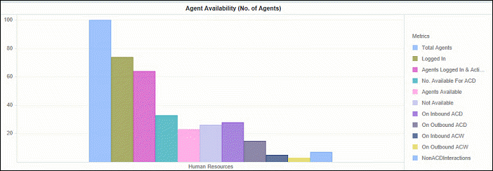
- Bar chart
This visualization displays your data in a graphical format, allowing you to examine your data by pointing to a bar on the graph and viewing the detailed information contained in each bar.
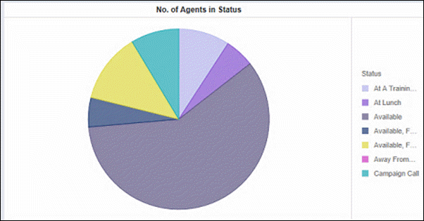
- Pie chart
This visualization displays your data in a colorful graphical format, allowing you to examine your data by pointing to a piece of the graph and viewing the detailed information for each piece of the pie graph.
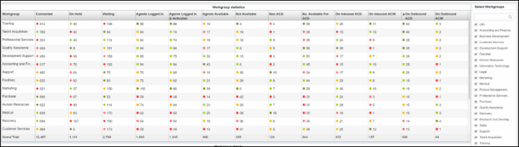
- Grid visualization
This visualization displays your data in an interactive grid, allowing you to sort, move, drill, filter, and perform additional manipulations on the data displayed in the grid.
For more information on using visualizations, see Finding Your Way Around a Dashboard .
Related Topics
Finding Your Way Around a Dashboard